
Up: Pictures
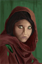
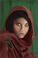
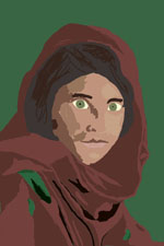
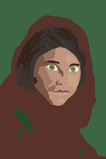
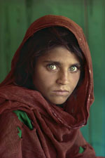
This is an attempt to draw Sharbat Gula, who was photographed for the June 1985 cover of National Geographic magazine. She was approximately 12 at the time.This magazine cover is supposedly NG's most famous cover. I always thought that she was stunningly beautiful.
This seemed like a good picture because she, unlike most magazine cover models, shows a lot of contrast in her skin tone. Also, the composition of this picture is very simple - another thing that is good for someone who is just getting comfortable with his tablet. In drawing, I am cheating a little bit - I am using a large grid (about 10 by 15 cells) to try to help line up my lines. Also, I am using the original image as my color palette. Skin tones seem to be terribly hard to get right.
| Day 7 | Day 6 | Day 5 | Day 4 | Day 3 | Day 2 | Day 1 |
 |
 |
 |
 |
 |
 |
 |
| Original | ||||||
 |
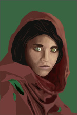
I've been tweaking this for a while now, and I think it's good enough. It could certainly be better, but I can't continue to work on Sharbat forever. Perhaps I'll come back and make a better one some day.
In all, I'm pretty pleased. I think it looks really good. Good enough that I plan to print it out and hang it at my office. Since the last time, I added a little texture and shading to her cloak and her face.
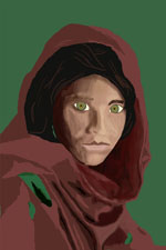
First pass at the hair texturing, and also added some detail work all around. Did a little more work on the eyes. Reshaped the face a little. I think I'm starting to reach my limit of perception - I can see that there are still major differences between the original and mine, but I'm having a hard time characterizing them.
I can see that, with a little more work around the eyes, I can change her expression from what currently appears to be too much surprise to something closer to the indifference that comes out in the original picture. The original seems to say "Yeah, but so what?" I don't have that yet.
Put a little texture in the background, and added some more detail and blending on the cloak. Also tweaked the eyelashes and eyebrows (which were placeholders before anyway). Some more facial shading, too. There is still something wrong with the face shading. The face doesn't quite look like it's the right shape.
I worked a little bit on the nose, the lips, the eyes, and the shading on the rest of the face. Also, I tried to get the hood to be the correct shade. I was about to finish working for the night, but then I noticed that the thumbnail looked like crap. I spent another 30 minutes cleaning up some shading and fixing some proportions, and now I think it looks pretty good. I had almost ruined the gaze, which is one of the most important parts of this piece. The gaze needs to be a cross of surprised and pissed off, and I had instead gotten "posed". I think I've got the look back again. I'm happy.